Case study one
Building a governable design system from brand strategy
Context
Because transparency is one of our core values, we decided to showcase one of our earliest projects: our own.
Client
Pivot&Helm
Industry
Brand strategy & design systems
Stage
Early startup
Timeline
5 weeks
The challenge
Pivot&Helm started with a brand strategy but no system to scale it. Their Figma files used flat, ad hoc naming that made components hard to find, harder to reuse, and impossible to govern as the product grew.
The core problem was threefold: connect brand strategy to a governable design system before design debt compounded; translate that strategy into reusable product and marketing assets; and create a clear path from individual component design to a production-ready library. Without this foundation, every new feature meant reinventing decisions already made.
The challenge
Pivot&Helm started with a brand strategy but no system to scale it. Their Figma files used flat, ad hoc naming that made components hard to find, harder to reuse, and impossible to govern as the product grew.
The core problem was threefold: connect brand strategy to a governable design system before design debt compounded; translate that strategy into reusable product and marketing assets; and create a clear path from individual component design to a production-ready library. Without this foundation, every new feature meant reinventing decisions already made.
Our approach
We began by strategically prioritizing which brand and visual identity guidelines would anchor the system's foundation, ensuring consistency without over-engineering. Next, we restructured the existing Figma files, replacing flat naming with a semantic, hierarchical convention built to scale.
On that foundation, we built components and layouts aligned to defined design principles, adding in-file annotations so teams understood not just what each component was, but how to use and evolve it. We consolidated everything into design guides and variable tokens ready for immediate production use, then briefed stakeholders on governance and a contribution model for extending the system into coded libraries and future touchpoints.
Our approach
We began by strategically prioritizing which brand and visual identity guidelines would anchor the system's foundation, ensuring consistency without over-engineering. Next, we restructured the existing Figma files, replacing flat naming with a semantic, hierarchical convention built to scale.
On that foundation, we built components and layouts aligned to defined design principles, adding in-file annotations so teams understood not just what each component was, but how to use and evolve it. We consolidated everything into design guides and variable tokens ready for immediate production use, then briefed stakeholders on governance and a contribution model for extending the system into coded libraries and future touchpoints.
Deliverables
Design token system
Design token system
30 core components
30 core components
Design system guides
Design system guides
Design files & assets
Design files & assets
Layout templates
Layout templates
Result
In five weeks, Pivot&Helm moved from a fragmented set of brand assets to a governable, production-ready design system built for growth. Their team gained a clear naming structure, documented usage guidelines, and a contribution model.
Result
In five weeks, Pivot&Helm moved from a fragmented set of brand assets to a governable, production-ready design system built for growth. Their team gained a clear naming structure, documented usage guidelines, and a contribution model.


Execution visuals
Hierarchical variable naming convention


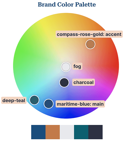
Color primitives & aliases




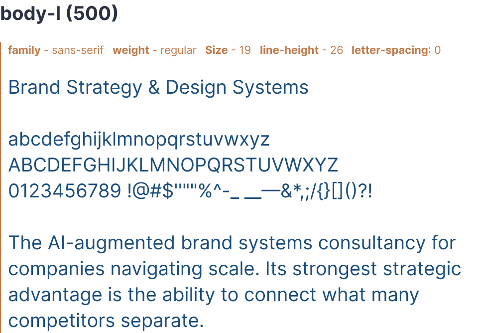
Typography primitives


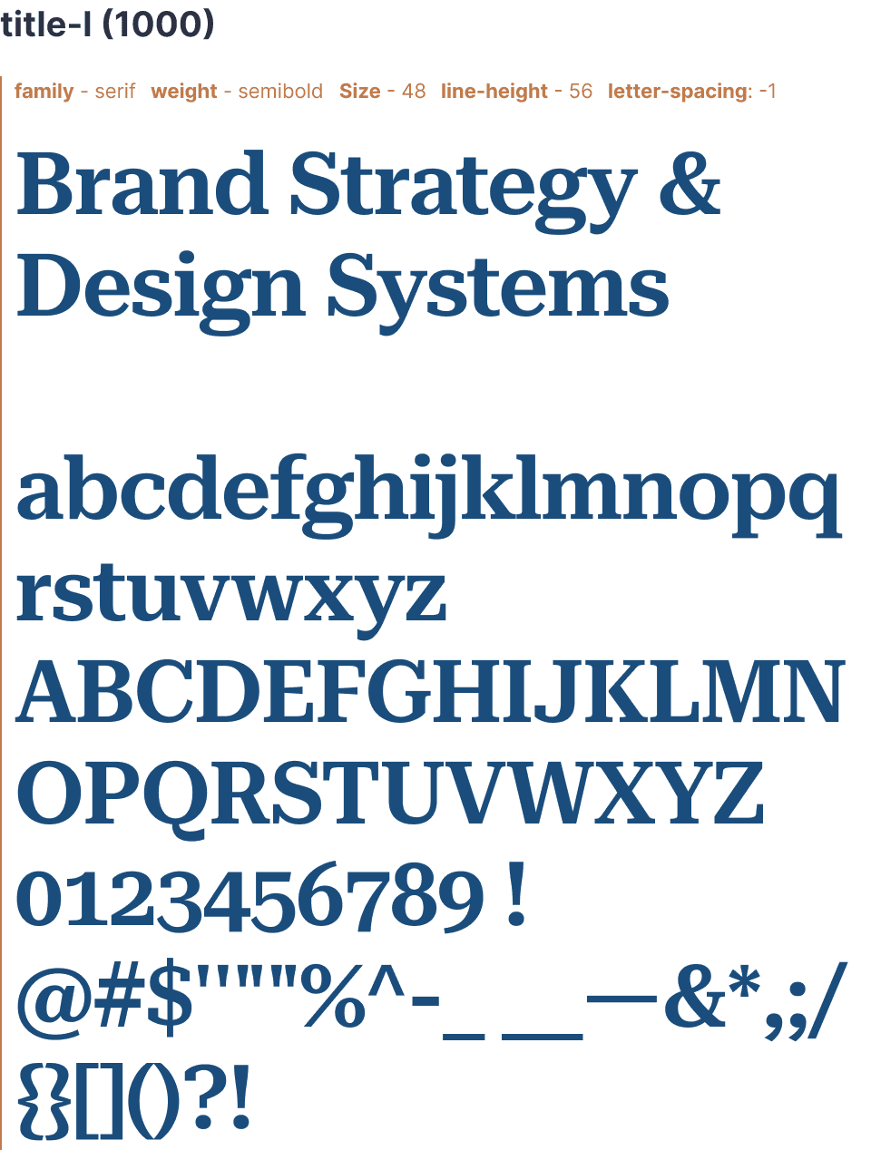
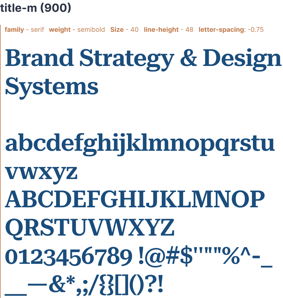
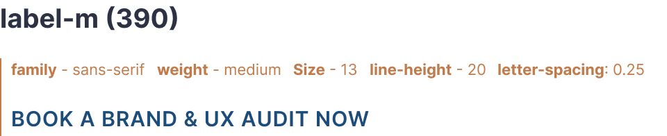
Text Styles






Effects & primitives


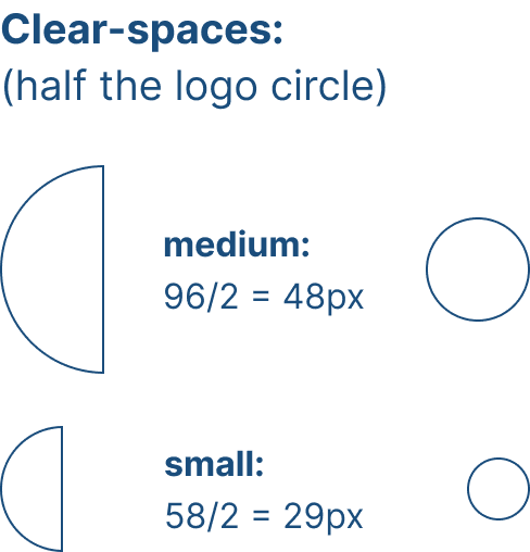
Logo lock-ups & clear-spaces